The Analytics dashboard shows how your Composerie store is performing: orders, revenue, and what shoppers do in the customizer. This guide walks you through the Overview tab, so you can read the headline numbers and break them down by date range. It is for any merchant who wants a quick, honest picture of sales.
What the Analytics page shows you
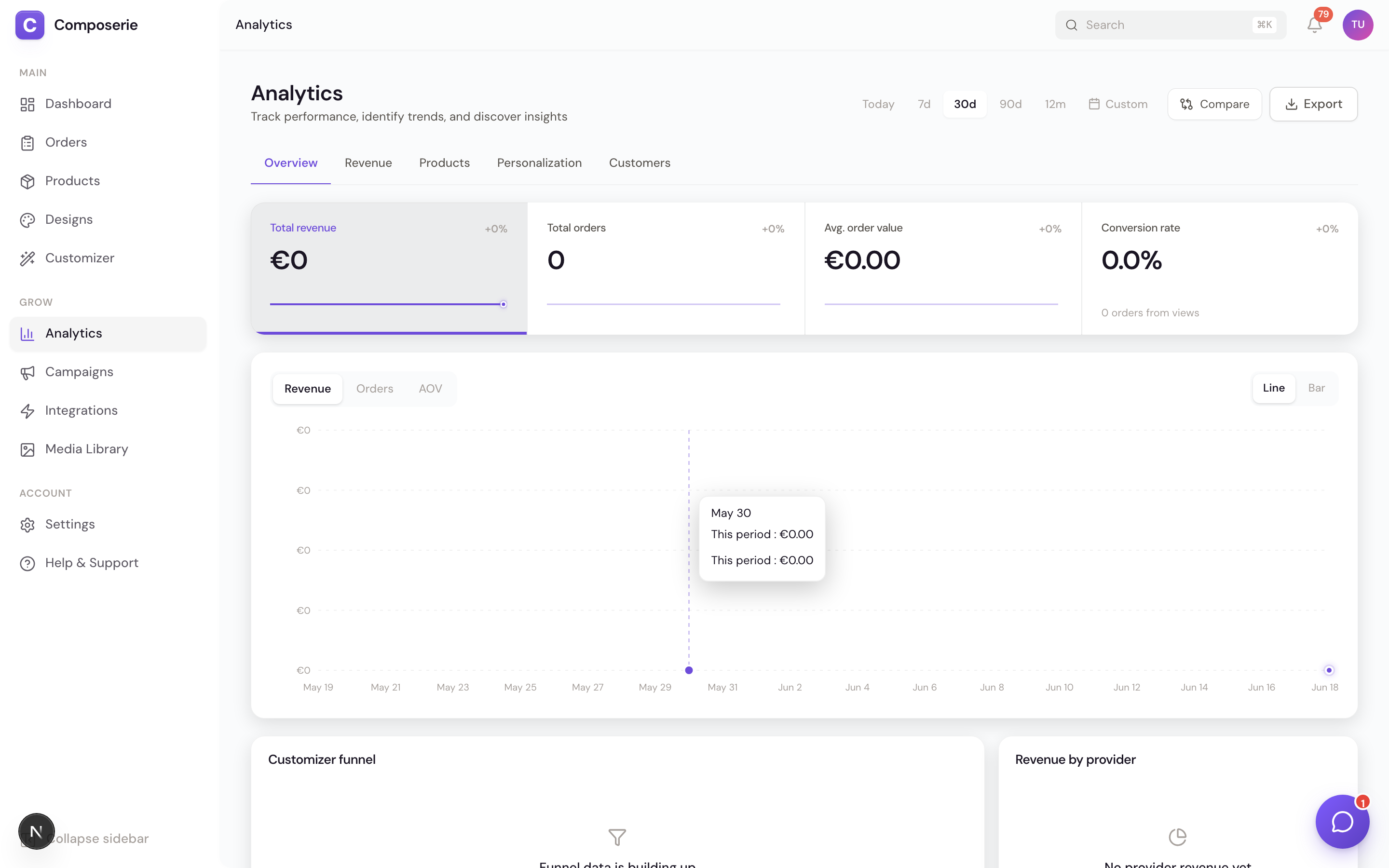
Analytics tracks the orders, revenue, and shopper activity for your store inside Composerie. The page subtitle reads “Track performance, identify trends, and discover insights.”
You can open it three ways, and all three go to the same /analytics page:
- The chart icon in the left sidebar.
- The command palette (search for “Analytics”).
- The bottom tab bar on mobile.
The page has five tabs along the top: Overview, Revenue, Products, Personalization, and Customers. This article covers the Overview tab. The other tabs have their own guides, including sales and revenue reports and the product performance report.
All money is shown in euros. Revenue and order counts read live from your orders, so the numbers here match the rest of your dashboard.
Pick a date range
The date range you choose controls every number on the page. Set it first, then read the results.
Choose a preset period
Use the segmented control in the top right of the header to switch between Today, 7d, 30d, 90d, and 12m. The page opens on the last 30 days by default.
Set a custom range
For a specific window, click the Custom button (the calendar icon), set a start date and an end date, then click Apply. The end date cannot be in the future, and it must be on or after the start date.
Compare to the previous period
Turn on the Compare toggle to overlay the previous period of the same length on the sales chart as a dashed line. A 30-day range compares against the 30 days before it.
Every card on the page reloads to match the range you pick.
Read the KPI ribbon and switch the chart
The KPI ribbon is the row of numbers directly under the tabs. It shows four headline metrics, and three of them control the chart below.
Read the four KPIs
The ribbon shows Total revenue, Total orders, Avg. order value, and Conversion rate. Each one has a delta labelled “vs previous period,” so you can see the percentage change at a glance.
Switch the chart metric
Click Total revenue, Total orders, or Avg. order value to plot that metric in the chart below. The selected KPI gets a violet label and a violet underline that points at the chart.
Read the chart
Below the ribbon, the chart has its own Revenue, Orders, and AOV switch plus a Line and Bar toggle. Hover any point to see the exact value for that day.
Scan the breakdown cards
Below the chart, the Overview tab shows cards that split the same period in different ways. They give you a fast read without leaving the page.
The cards are:
- Customizer funnel shows how shoppers move from a product view to a finished design.
- Revenue by provider is a donut that splits revenue across your print providers.
- Top products ranks your best-selling personalizable products.
- Top countries ranks revenue by shipping destination.
- By channel groups sales by where the order came from.
Each card links out to its full report. The Customizer funnel and conversion live in their own guide, sales breakdowns are covered in sales and revenue reports, and product ranking is in the product performance report.
Cards that have no data yet show a short message that tells you when the data will appear. For example, country revenue appears once orders ship. Revenue by provider has a Details link that jumps to the Revenue tab, and Top products has a View all link to your products.
Why are some cards empty?
They have no data for the range you picked yet. Each empty card shows a short note about when its data will appear, such as country revenue showing up once orders ship.
What date range does the page use by default?
The last 30 days. Use the segmented control or the Custom button to change it.
Why does conversion rate have no chart?
It is a ratio of orders to product views, not a daily total, so it is shown as a single percentage instead of a plotted line.
Next
Ready to go deeper on the money side? Read sales and revenue reports.