Text is the most common thing shoppers personalize: a name, a date, a short message. This guide shows you how to add a text element in the Design Studio and set its font, size, color, alignment, and spacing. It also covers auto-fit, which keeps long text from spilling outside its box. It is written for anyone building a personalizable product, no design background needed.
Add a text element
You add text from the Elements panel. New text lands in the center of your print area, ready to edit.
Open the Elements panel
In the Design Studio, click Elements in the icon rail on the left. The panel opens with a grid of tiles you can add to your design.
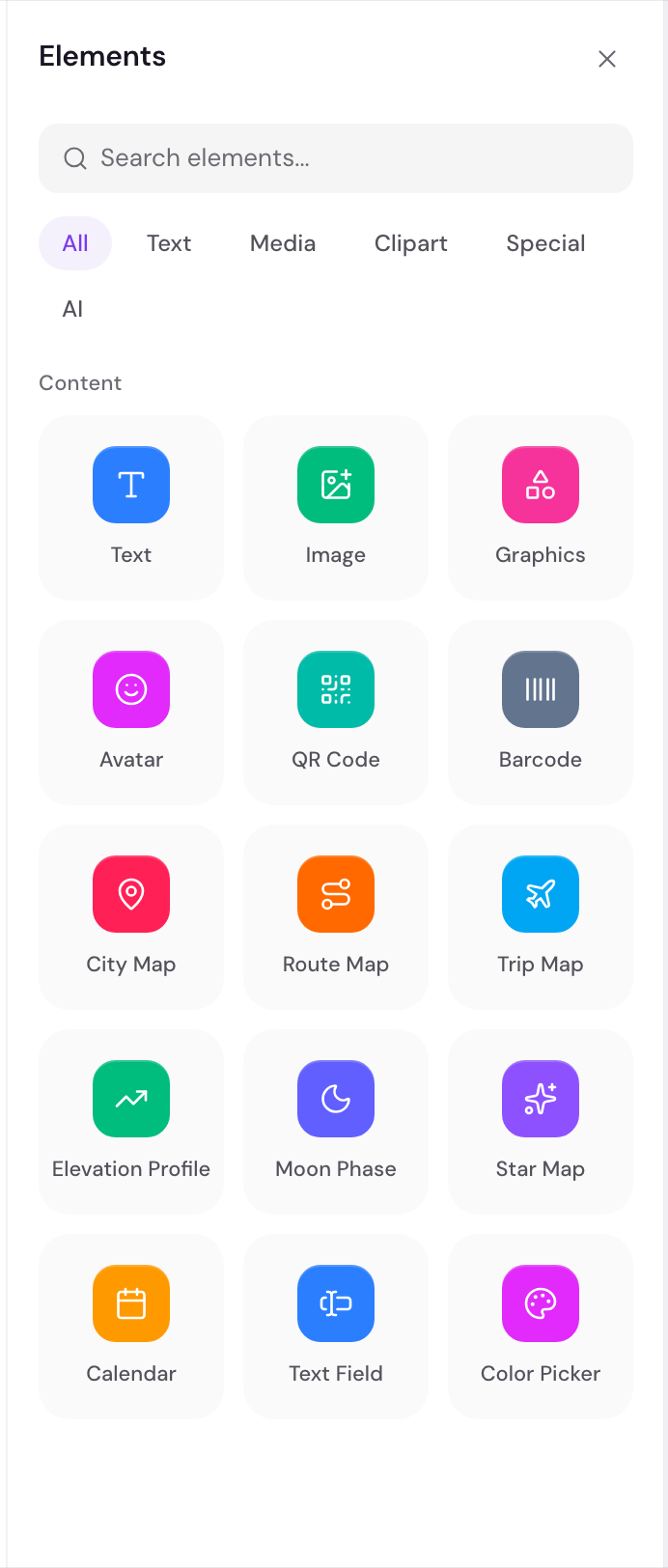
Add the Text tile
Click the Text tile to drop a text element into the center of the print area. You can also drag the tile onto the canvas to place it exactly where you let go.
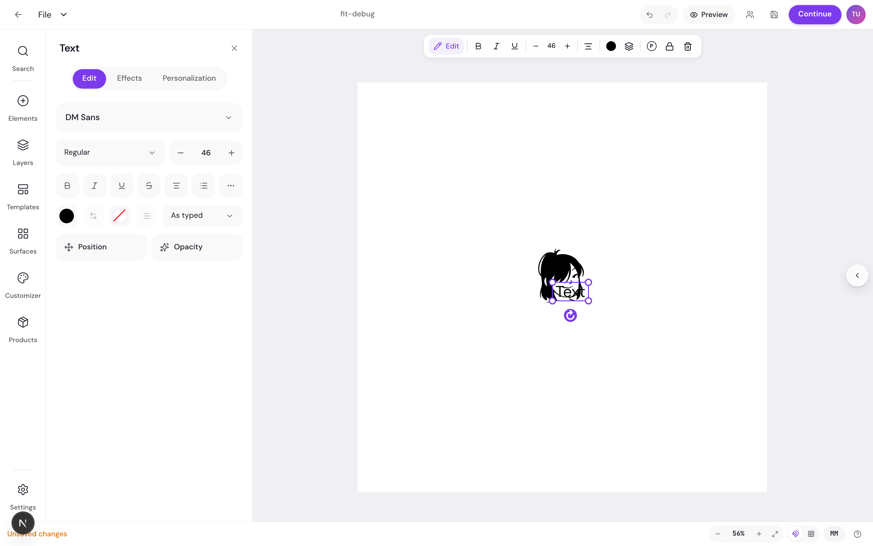
The new element starts with the word “Text”, the DM Sans font, a black fill, and center alignment. It is set to be customer-editable by default, so shoppers can change it on your storefront.
Start from the selected element
Your new text is selected right away, and its properties panel opens on the right. A floating toolbar appears above the element with quick controls: Edit, bold, italic, underline, a font-size stepper, an align button that cycles through options, and a color swatch.
Set the font, size, and color
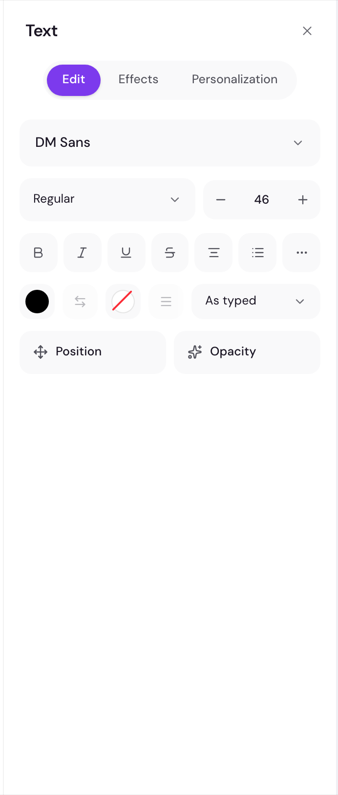
The properties panel controls how your text looks. Work top to bottom: content first, then font and color, then alignment and spacing.
Type your content
At the top of the properties panel is a text box. Type the words you want here. This is the placeholder text shoppers see before they personalize it, so use something clear like a sample name or “Your text”.
Pick a font, size, and weight
Use the font picker to choose a typeface. Set the font size in the size field. Toggle bold or italic to match the style you want. For a deeper look at fonts and how to add your own, see choose and load fonts.
Choose a color and alignment
Click the fill color to set the text color. Set the horizontal alignment to left, center, right, or justify. You can also set vertical alignment to top, middle, or bottom, plus underline or strikethrough if you need them.
Adjust spacing and casing
Use tracking to change the space between letters and line spacing to change the gap between lines. Text transform changes the casing without retyping: choose none, uppercase, lowercase, or capitalize.
For more on filling text with color and the color tools across the editor, see colors and fills. To add a stroke, a background, or curved text, open those separate sections in the properties panel, or read text effects.
Keep long text inside the box
A shopper might type a longer name than you planned for. The Text behavior section keeps text tidy no matter how much they enter.
Open the Text behavior section
Scroll the properties panel to the Text behavior section and open it. This is where the fitting and wrapping options live.
Turn on Auto-fit text
Turn on Auto-fit text so the text shrinks to stay inside its box. Set a min and max font size to control how small it can get and how large it can grow. The text scales between those two values to fit.
Use multiline and a character cap
Turn on Auto multiline to let text wrap onto more lines instead of one long line. Use Max characters to cap how much a shopper can type. There is also a Vertical text option if you want the text to read top to bottom.
Frequently asked questions
Can shoppers change my text on the storefront?
Yes. New text is customer-editable by default, so shoppers can type their own words. You control whether each element is editable in its properties.
What font and color does new text start with?
New text starts with the DM Sans font, a black fill, and center alignment. You can change all of these in the properties panel or the floating toolbar.
My text runs off the edge of the print area. What should I do?
Open the Text behavior section and turn on Auto-fit text, then set a min and max font size. Add Auto multiline so longer entries wrap, and a Max characters cap to limit the length.
Where do I change which text shoppers can edit?
Each text element has a personalizable setting. See the make fields customer-editable guide for the full flow.
To decide which text elements your shoppers can change, read make fields customer-editable.
Next: choose and load fonts.