This guide walks you through the Design Studio so you know where everything lives before you start building. It is for anyone opening the editor for the first time. By the end you will recognize the icon rail, the canvas, the top bar, the floating toolbar, and the zoom controls, and know what each one does.
What the Design Studio is for
The Design Studio is where you build a product template. You place text, images, shapes, and other elements on a canvas, then decide which ones a customer can change in the storefront.
The canvas equals the print area. What you see on the canvas is what gets printed on the product. That makes it easy to position things exactly where you want them.
You can open the Design Studio in two ways. Open it from a product to edit that product’s design, or open a standalone design and attach it to a product later.
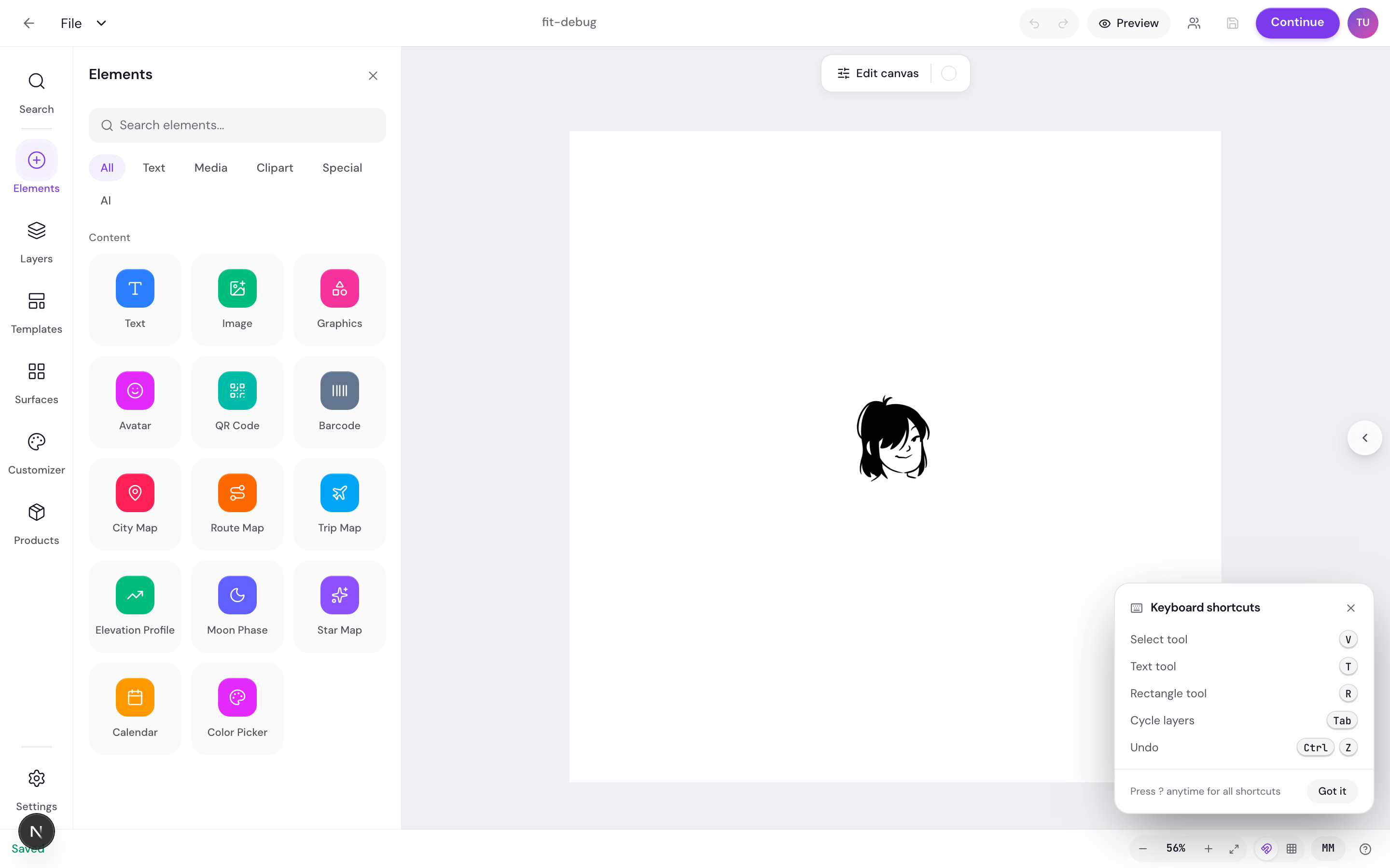
The left icon rail
The icon rail runs down the far-left edge of the editor. It is how you switch between the tools and panels you work with most.
The rail items appear in this order:
- Search: find elements and assets to add.
- Elements: add text, shapes, graphics, and uploads.
- Layers: see and reorder everything on the canvas.
- Templates: start from or save a reusable layout.
- Surfaces: switch between the print areas of the product.
- Customizer: set up the form shoppers fill in.
- Products: link the design to a product.
- Settings: pinned at the bottom of the rail.
Click an item to open its panel. Click the active item again to close the panel. Each item also has a tooltip on hover with a short description, so you can confirm what it does before you click.
The top bar, floating toolbar, and zoom
Three controls surround the canvas: the top bar above it, a floating toolbar just below the top bar, and the zoom pill in the bottom-right corner.
The top bar
The top bar holds your navigation and save controls. From left to right you get:
- A Back arrow to leave the editor.
- A File menu.
- The design title in the center, which you can click to rename inline.
- An Undo and Redo pill.
- A Preview button.
- A customer-preview toggle to see the design as a shopper would.
- An icon-only Save button on the right.
A Save toast appears under the top bar. It shows Saving while your work is being stored, then Saved when it is done, or an error message if something goes wrong.

The floating toolbar
A floating toolbar sits between the top bar and the canvas. Its buttons change based on what you have selected. Select an image and you get image tools. Select text and you get text tools. Select another element and you get generic element tools. Select more than one element and you get multi-select tools. With nothing selected, you get canvas-level tools.
This keeps the controls relevant to whatever you are working on right now, so the toolbar never feels crowded.
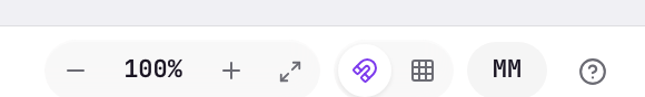
The zoom controls
The zoom controls are pinned to the bottom-right of the canvas. From left to right the pill shows:
- A unit toggle that switches between millimeters (mm) and pixels (px).
- A zoom out button.
- A percentage that also acts as Fit to screen when you click it.
- A zoom in button.
- A Fit to screen button.
Use Fit to screen any time the canvas drifts out of view or you want it centered again.
Next
Now that you know the layout, add and style text to put your first element on the canvas.